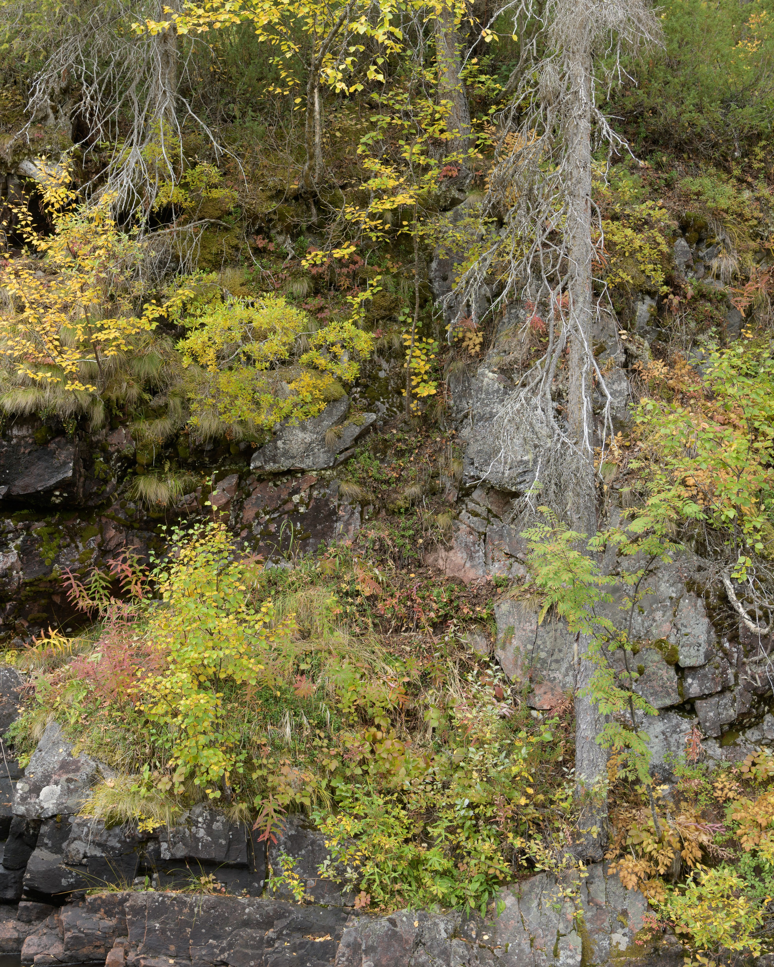
It was recently reported that this frame has a digital double with a weak color separation. Thus I embarked on an affair to see if there was a way to bring it to shape. So it turned out it was possible to separate the tones and bring it to a visual match with the film, too. However, looking at it I was thinking: “The colors are still different. What gives?..”
Then it turned out the double is not a double at all, but the same composition captured after a two days interval. And here, just two days make such a difference in the natural colors of the foliage.
Let’s have a look.


Which is which? Where is the film and where is the digital? Your answers, please, into the chat.
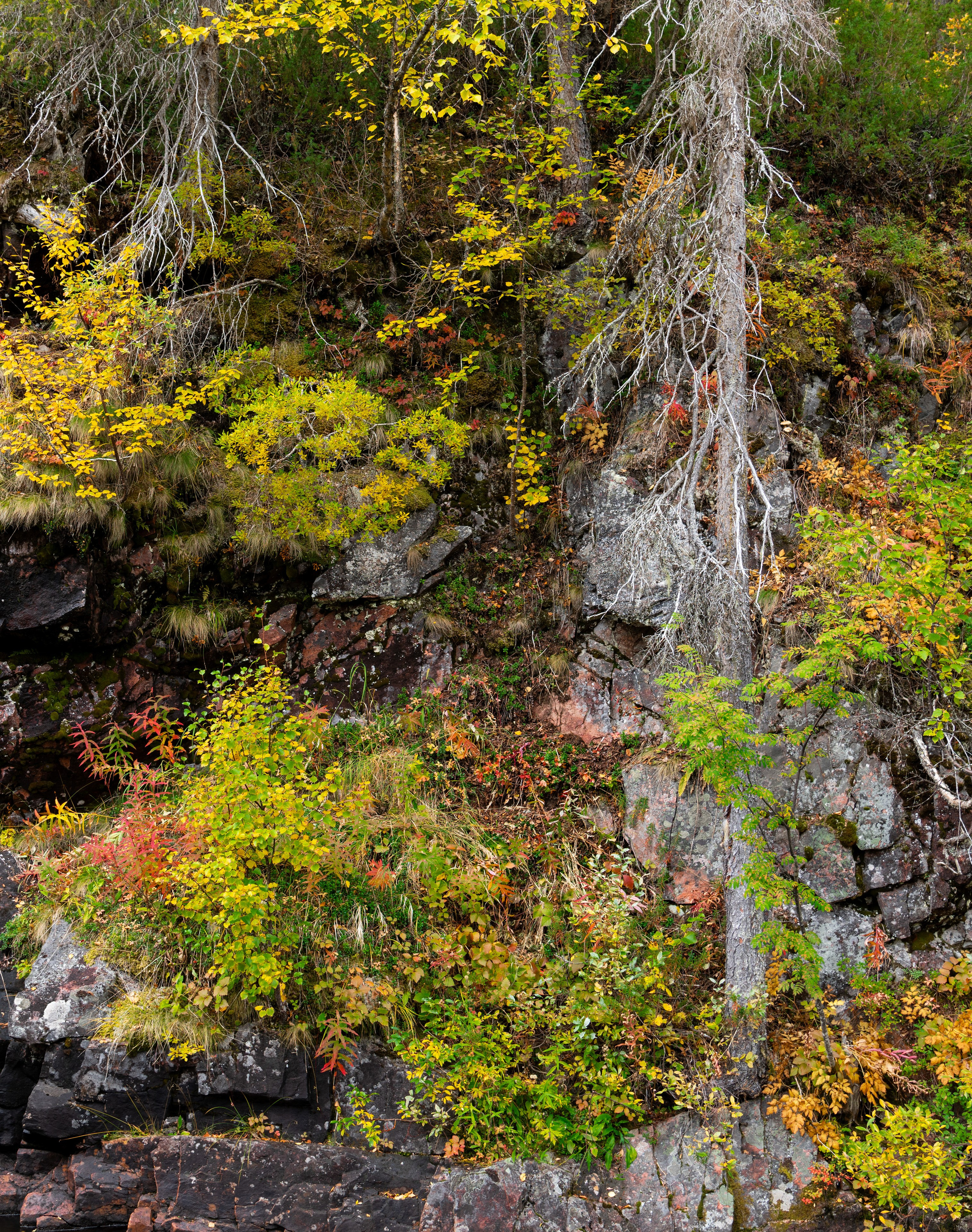
Besides the difference in the medium, the captures were taken with different lenses and from slightly different positions, so the images don’t quite align. Nevertheless, for a more precise comparison, here is an option:
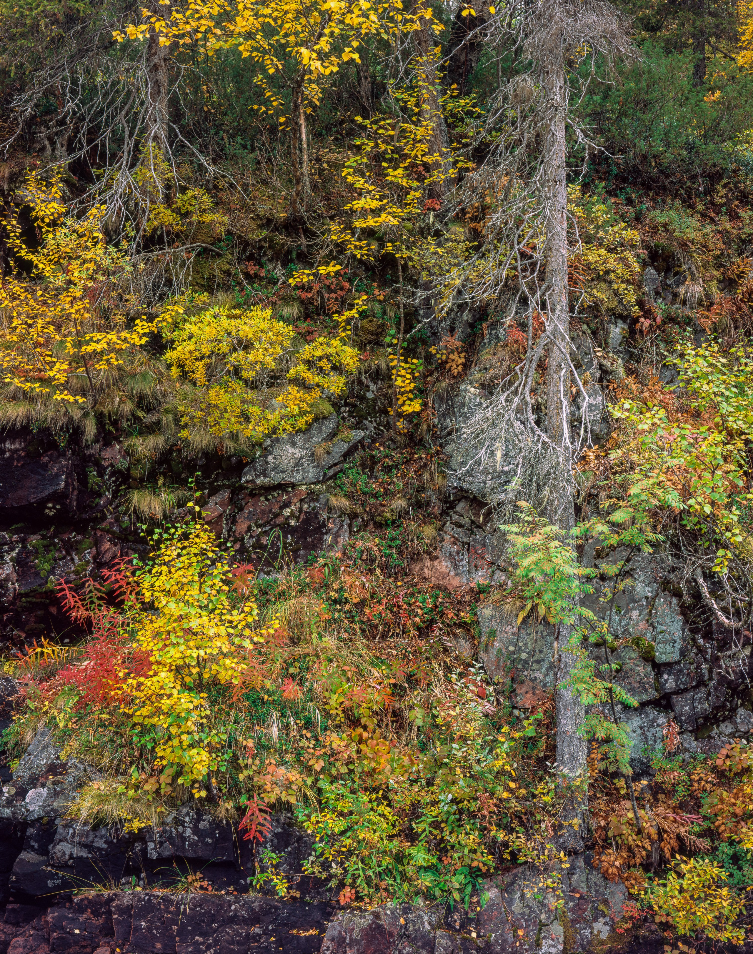
A notable observation is the only profile able to separate the colors was the Adobe Color, which I usually ignore due to its populist handling of contrast. However, even a custom camera profile wasn’t able to do the job. The red bushes by the left edge were timidly ranked by it as green. Only the manufacturer’s Camera Landscape profile handled the color equally well, but it also raised the contrast even more. Here the main Adobe’s profile finally found its use. Generally speaking, the separation of greens and browns appears to be a typical weak spot of many a digital solution. Yet, a natural appearance of landscape scenes depend on this property rather much.
Here is how the non-separated colors look: